Context
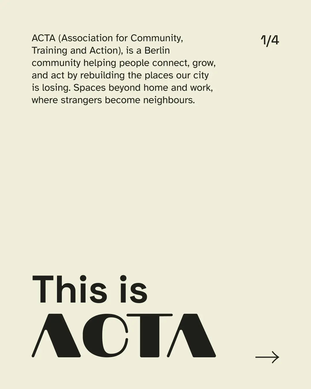
ACTA is a Berlin community association rebuilding the city's third spaces, the places beyond home and work where people meet, learn, and act together. It began in September 2025 as a table outside a Späti, where fifteen people pinned their favourite spots on an old map of Berlin, and grew into ACTA, Association for Community, Training, and Action. Today it is around thirty people working across four pillars: belonging, empowerment, civic engagement, and creative entrepreneurship.
Berlin is full of community organisations, and a lot of them communicate in the same crowded, busy way. In a feed that gives a passing viewer three or four seconds, that noise blurs together, and a young community is easy to miss. The first job of the identity was simple to say and hard to do: make ACTA recognisable at a glance, a grounded presence in a landscape that mostly reads as noise.
The community also had no shared design system to work from. Communication was made one post at a time, with no common logic carrying from one to the next, so nothing accumulated into something recognisable. The gap was structural: not a lack of effort, but the absence of a system.
The brand also had a second job most communities do not. It had to stay warm and welcoming for the community, and structured and credible for the schools, NGOs, and funders it wants to run training and youth programmes with. Two registers, held in one system that stays coherent no matter who is making things.
The starting point
ACTA came to me wanting a visual identity, but the brief was loose: a name, a few events, and a feeling of what they wanted rather than a definition of it. So the first task was not design. It was turning that vagueness into something precise enough to design against.
My role
Tools
- Figma
- Canva (team handoff)
Building the strategy
To design for a community, I first had to understand it, precisely. ACTA gave me fragments. So I built the strategic foundation myself, gathering everything they shared and expanding it into something exact: who ACTA is for, why it exists, what makes it different, and how it should sound.
The work used the frameworks you would expect of a brand strategy: a positioning statement, audience segmentation across the three groups ACTA serves (peers, youth, and institutional partners), a competitor and white-space analysis of the adjacent Berlin organisations, a brand architecture, and a defined personality and voice. It went beyond strategy into the verbal identity (tone of voice, vocabulary, and the pitches ACTA uses) and the behavioural identity (event rituals and community guidelines), so the brand holds together in words and in conduct, not only in images.
A handful of decisions from that work shaped everything visual that came after. ACTA is organised around third spaces, the places beyond home and work that are disappearing, and rebuilding them. It runs on four pillars. It speaks in two registers, warm for the community and structured for institutions. Its character is quietly bold, warm, and unpolished but precise, and deliberately not corporate, not over-polished, not aestheticised over substance. Two of these set firm rules before any visual work began: the two registers, and inclusion treated as a design principle rather than a label.
The finished strategy became more than my own brief. It is a document the ACTA team still returns to, to keep their communication and their actions aligned.
The architecture, the personality, and the guardrails, at a glance:
The four pillars
Belonging & Connection
Gatherings that turn strangers into neighbours.
Empowerment & Education
Skills and confidence through training and peer exchange.
Civic Engagement & Impact
Bridging citizens and policymakers through advocacy and forums.
Social & Creative Entrepreneurship
Turning ideas into projects through collaborations and design events.
Personality
Warm
Holds space, makes room, takes care.
Open
Curious about the new. Doesn't gatekeep.
Inclusive
Designs for many backgrounds, not one default.
Adaptive
Figures it out when reality doesn't match the plan.
Quietly bold
Takes positions and acts on them, without performing.
What ACTA is not
Not corporate
Plain language, no synergy, no buzzwords.
Not exclusive or insider-coded
No "if you know you know." It explains itself to newcomers.
Not aestheticised over substance
Hands dirty, sometimes literally.
Not performative or hype-driven
Grounded and descriptive, no "we're so excited to announce."
From strategy to system
Before deciding what ACTA should look like, I mapped the qualities the identity had to carry, the keywords that came out of the strategy. A small set of dominant ideas surfaced: quietly bold, warm, unpolished but precise, peer-to-peer, analog, and inclusive.
From that map, and from visual research, one direction held: a constrained kit of geometric parts that anyone can recombine into a coherent whole. The reasoning was practical as much as visual. ACTA is run by non-designers who need to make their own posts, so the brand had to be composed rather than drawn, and never leave a layout to chance.
The approach sits in a clear lineage: Italian rationalist design, Bauhaus geometry, Nordic system identities, and contemporary museum branding, all of which build a coherent visual world from a fixed set of parts.
The visual identity
The result is a fixed vocabulary the brand is built from: a logo system, a colour logic, two typefaces, a kit of shapes, and a set of patterns. The parts are locked, the combinations are open.
New logo system
The whole system hangs on one move: reading the A as a doorway. Its interior triangle is a threshold, the gap between outside and in, which is ACTA's third-space idea made into a shape.
The letterforms are built on a construction grid, and the diagonal used everywhere else in the brand, photo cuts, colour splits, container edges, is the signature angle, taken from the slope of the A's leg. Every diagonal in the system traces back to the logo, which is what keeps a kit made for non-designers from drifting.
The main logo, used in all communication pieces.
The secondary logo, for institutional contexts like email signatures.
The icon, used when there isn't room for the full logo, like an Instagram profile picture.
The lockup for ACTA's external training arm.
A locality lockup, kept in case ACTA expands beyond Berlin in future.
The split between the lockups is the strategy made visible: the secondary logo and the ACTA Trainings lockup exist because the brand speaks in two registers, one warm for the community, one structured for the institutions it wants to run training with.
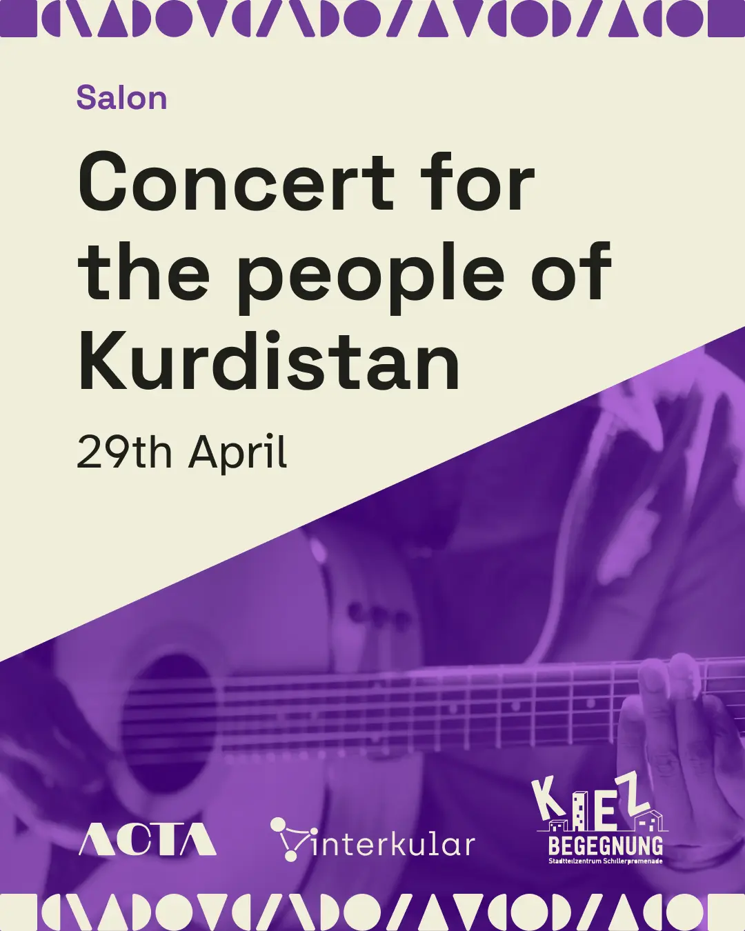
Colour palette
Colour carries meaning. Each of the four pillars owns one colour, so colour tells you which pillar a piece of content belongs to before you read a word. Anything not tied to a pillar stays in warm near-black and cream.
warm, alive, gathering
growth, energy, learning
considered, fresh civic energy
creativity, imagination, weight
For the structural neutrals I chose a warm near-black and a soft cream, Moon Mist, instead of pure black and white, so the communication feels warm and welcoming.
Colour also carries the inclusion rule. All four pillar colours hold body type on cream, so meaning is never left to colour alone, the inclusion-by-design principle made literal rather than stated.
Type system
Two typefaces split the work: Space Grotesk for identity moments and headlines, Atkinson Hyperlegible for body and information, chosen for legibility without looking like an accessibility font.
A geometric sans with humanist warmth. It carries character and design awareness, and is used for identity moments, headlines, category labels, and key statements.
Designed for low-vision readers, it maximises character differentiation without looking like an accessibility font. It carries body text, captions, navigation, and information like dates and times.
Visual kit
The visual kit is a constrained set of shapes, each named for what it does (Threshold, Space, Motion, Action, Gathering, Welcome, Window), with fixed rules for orientation and scale, so the outputs vary while the system stays consistent. Threshold and Window carry the doorway idea from the logo into the kit.

Threshold

Space

Motion

Action

Gathering

Welcome

Window
Those shapes recombine into a small number of set patterns: one for everyday posts, one reserved for Trainings, one for merchandise. The team places a ready-made pattern rather than designing a new one. The Trainings-only pattern is the two-register logic again, a structured signal for the institutional arm.

Pattern 1
Used on all posts except Trainings and merch.

Pattern 2 (Trainings)
Used only on ACTA Trainings posts.

Pattern 3 (Merch)
Used on merch and collateral only.
The system in use
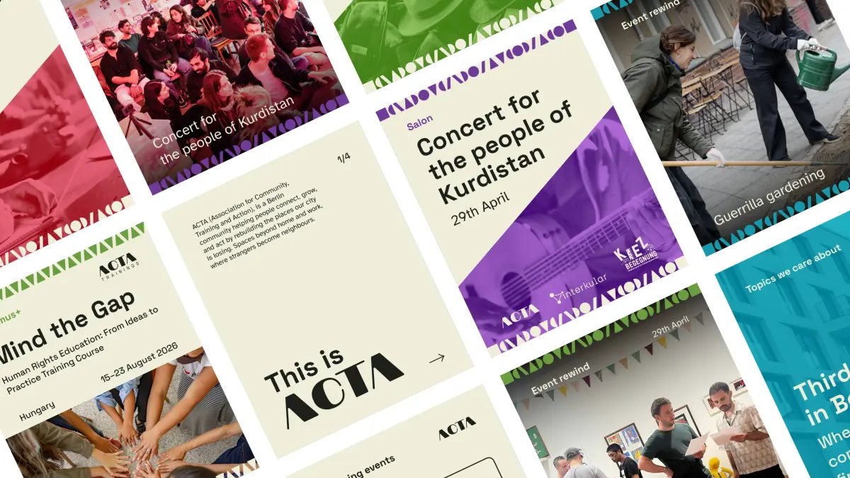
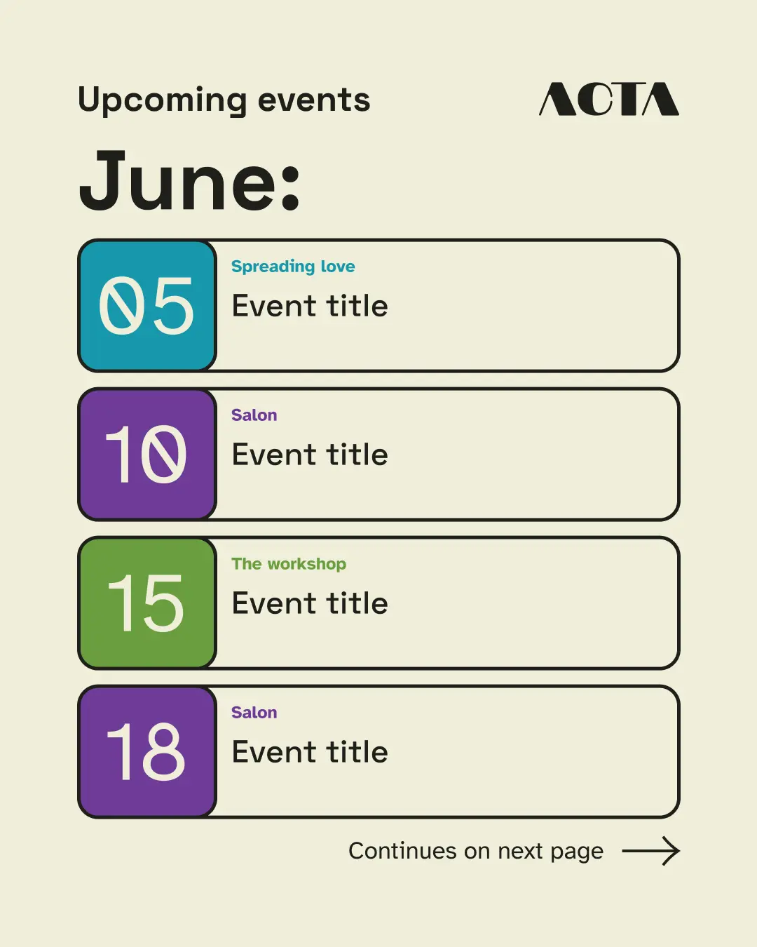
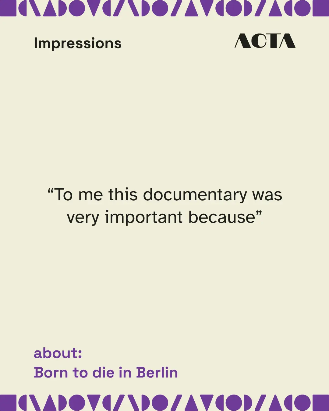
The first place the system had to work was the one touchpoint ACTA already had: Instagram. Before any templates, I mapped what each kind of post is for, an editorial system covering events, announcements, recaps, training, the people behind ACTA, and the topics they care about. Templates follow purpose, not the other way around.
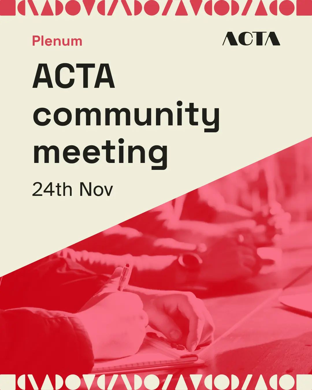
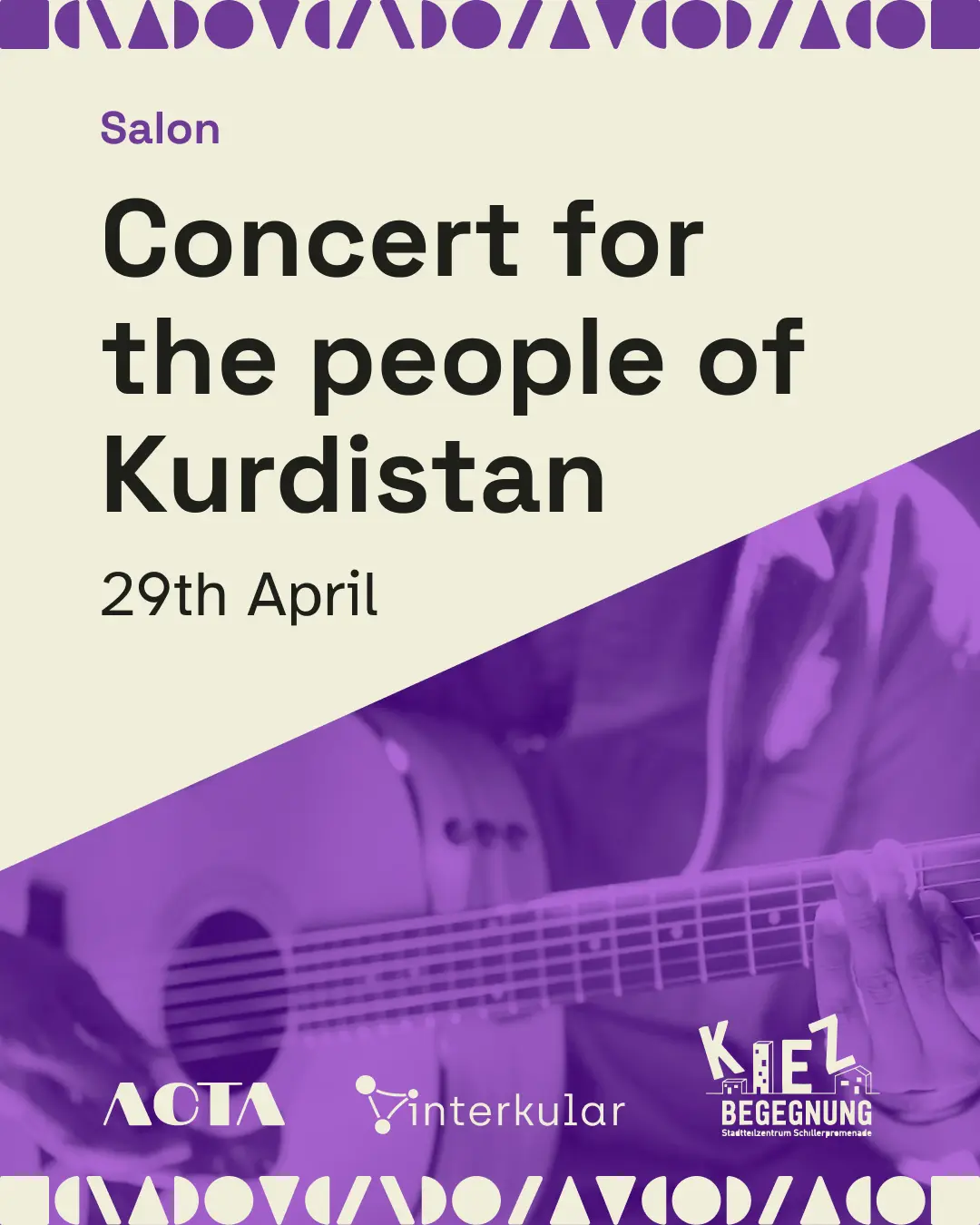
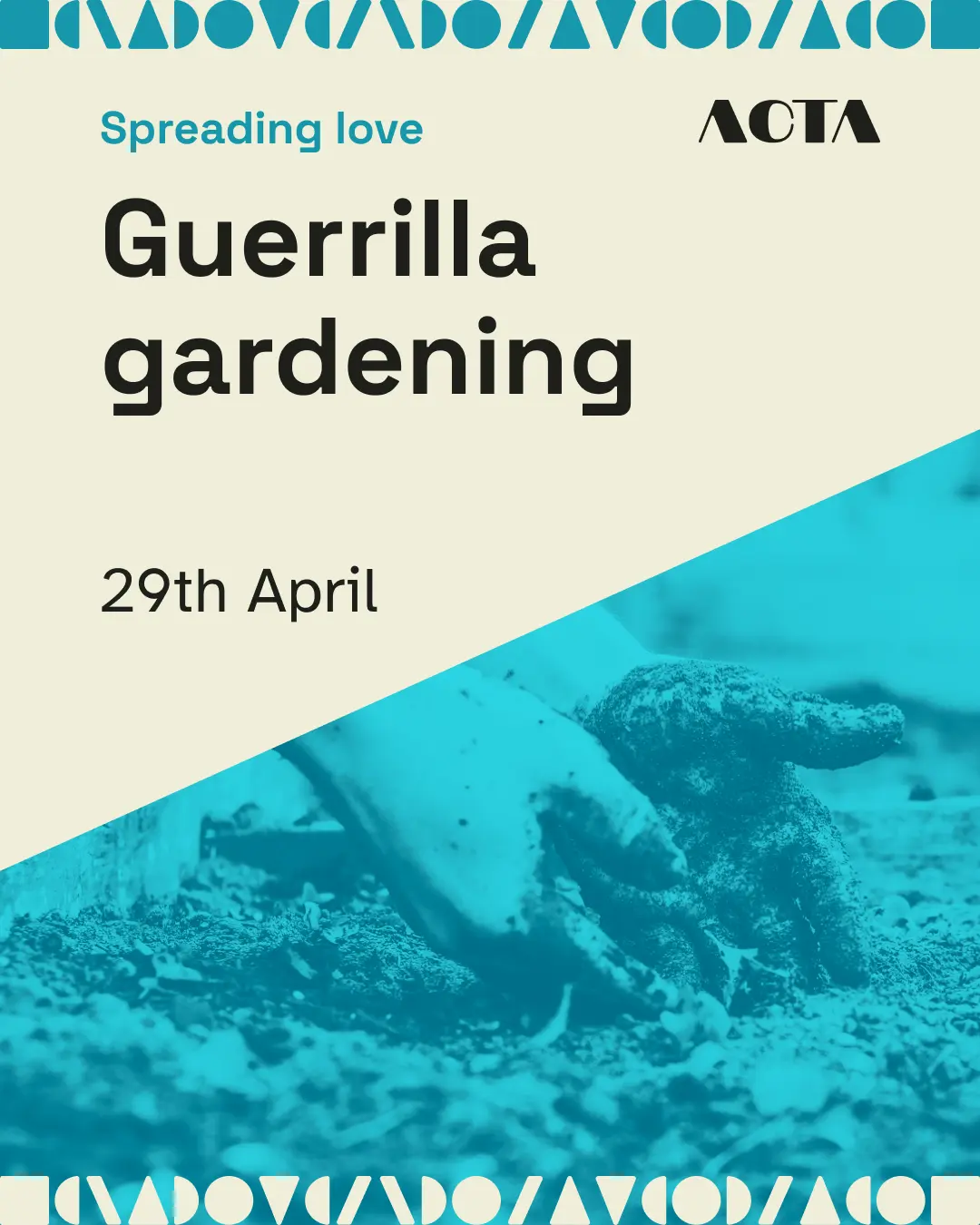
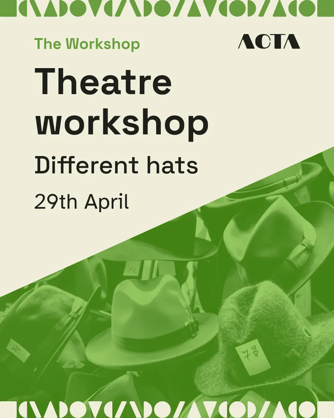

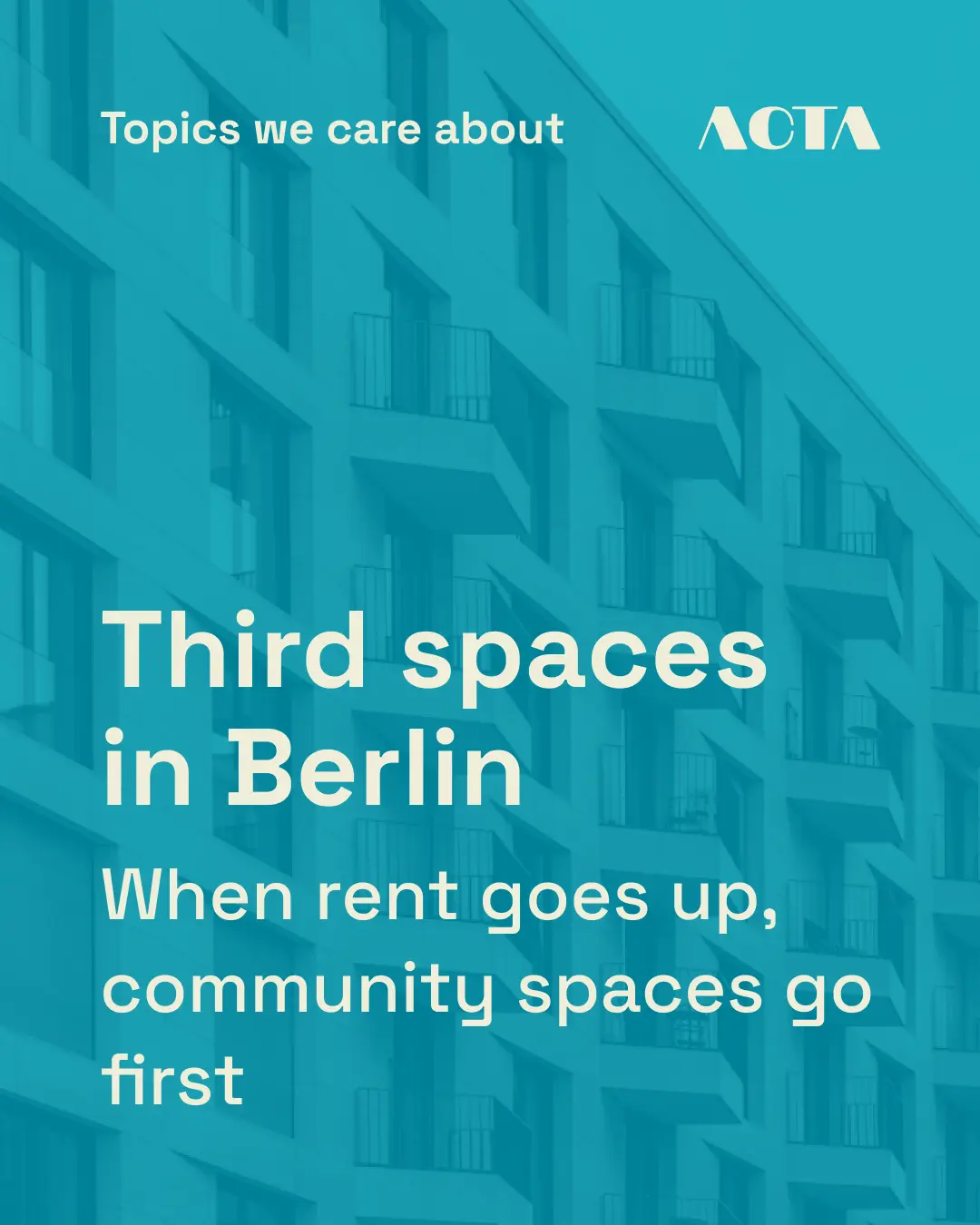
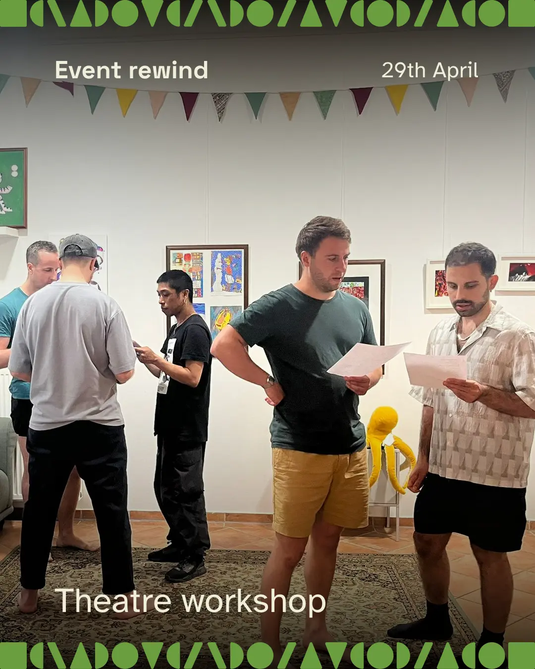
Each event post works like a book cover: one image, one headline, one colour. In a feed that gives you three or four seconds, someone who knows nothing about the event can still grasp it at a glance, and scroll on for the detail if they want it. It is also a position: a grounded, intentional presence in the noise rather than one more thing shouting.
Smaller decisions do quiet work. The warm cream background is easier on the eyes than pure white and reads less corporate. And three separate "who we are" posts became one pinned carousel, so a first-time visitor has a single clear place to start.
Read as a whole, the redesigned profile is built to hold together. Coloured posts signal events, photos in matching colours come from those events, and the rhythm makes the feed scannable at a glance. The current profile and the redesigned system, side by side:
The system is handed to the team as Canva templates, so they can make things without me, and they begin posting with it from the next handoff session. Social is the foundation the rest grows from: the website, the event registration flow, and printed flyers all extend from the same kit, so they hold together without being rebuilt from scratch each time.
The website, the Eventbrite registration flow, and printed event flyers are being built now, each extending from the same kit. I'll update this case as they go live.
Reflection
The hardest and most useful part was the strategy. ACTA handed me something vague, and turning it into a precise foundation forced me to understand the community before designing for it. Every visual decision after that had something firm to point back to.
The system is built on constraints, and that is the point. A fixed kit, one colour per pillar, set patterns: limits that make the right choice the easy choice, so the brand stays recognisable as it grows and as different hands make things. For a community of non-designers, constraint is a form of generosity.
What comes next is rollout: the templates go live, and the website, the registration flow, and the flyer templates each extend from the social foundation, with the team carrying the system forward on their own.