What was missing
Design events in Milan tend to feel formal, institutional, and a little stiff. People show up to network — to swap business cards, to perform competence, to be seen in the right rooms. There's nothing wrong with any of that, but it doesn't tend to produce friendships. And what's missing from a creative life if not friendships with other creatives?
The other gap: most communities here run in Italian, which quietly excludes the international designers Milan keeps attracting. Duru and I had both felt it from opposite sides — me as someone Italian who wanted easier ways to meet international creatives, her as someone who'd moved here and found those rooms harder to enter.
What we tried
We started Designers of Milan on MeetUp, expecting it to grow slowly. Instead it picked up followers almost immediately — there was a real, unmet appetite for what we were trying to build. We expanded onto Telegram and then Instagram, where the visual identity could do more work.
The first event was a casual aperitivo. We were nervous nobody would show up.
8
people showed up to the first event
It sounds small. It wasn't. Eight strangers who'd never met decided to spend a weeknight evening together because we said "come and have a drink with other designers." That was the proof we needed — that the appetite was real, that the format worked, that the bar didn't have to be higher than "show up, be a person, talk to people."
Events are still ongoing.
The visual system
The visual identity had to do something specific: signal "this is for designers, but it's not trying too hard". We didn't want it to look like a corporate networking event. We didn't want it to look like a casual amateur thing either. We wanted it to land in between — playful, considered, warm, a little imperfect on purpose.
Logo. The logo is a small visual echo of Tap & Know — another physical-digital project Duru and I designed together. We liked the idea of two of our shared projects carrying a quiet visual DNA between them.
Palette. Three colours — black, red, white — that work as well on a printed flyer as on an Instagram post. Restrained on purpose. The shapes do the talking.
Typography. Hiragino Maru Gothic Pro for the logo and headings — friendly, rounded, with a quiet Japanese influence. PP Neue Montreal for body text — clean and modern, lets the visuals carry the personality.
Shapes. Geometric shapes paired with rough sketches — imperfect, playful, but still curated. The roughness is the point: it signals that real humans made this, that you don't have to come polished, that the bar is friendliness not perfection.
Content strategy
Three recurring formats run on the Instagram account — each does a different job for the community.
Three recurring formats
- Event recaps — afterglow from the last meet-up.
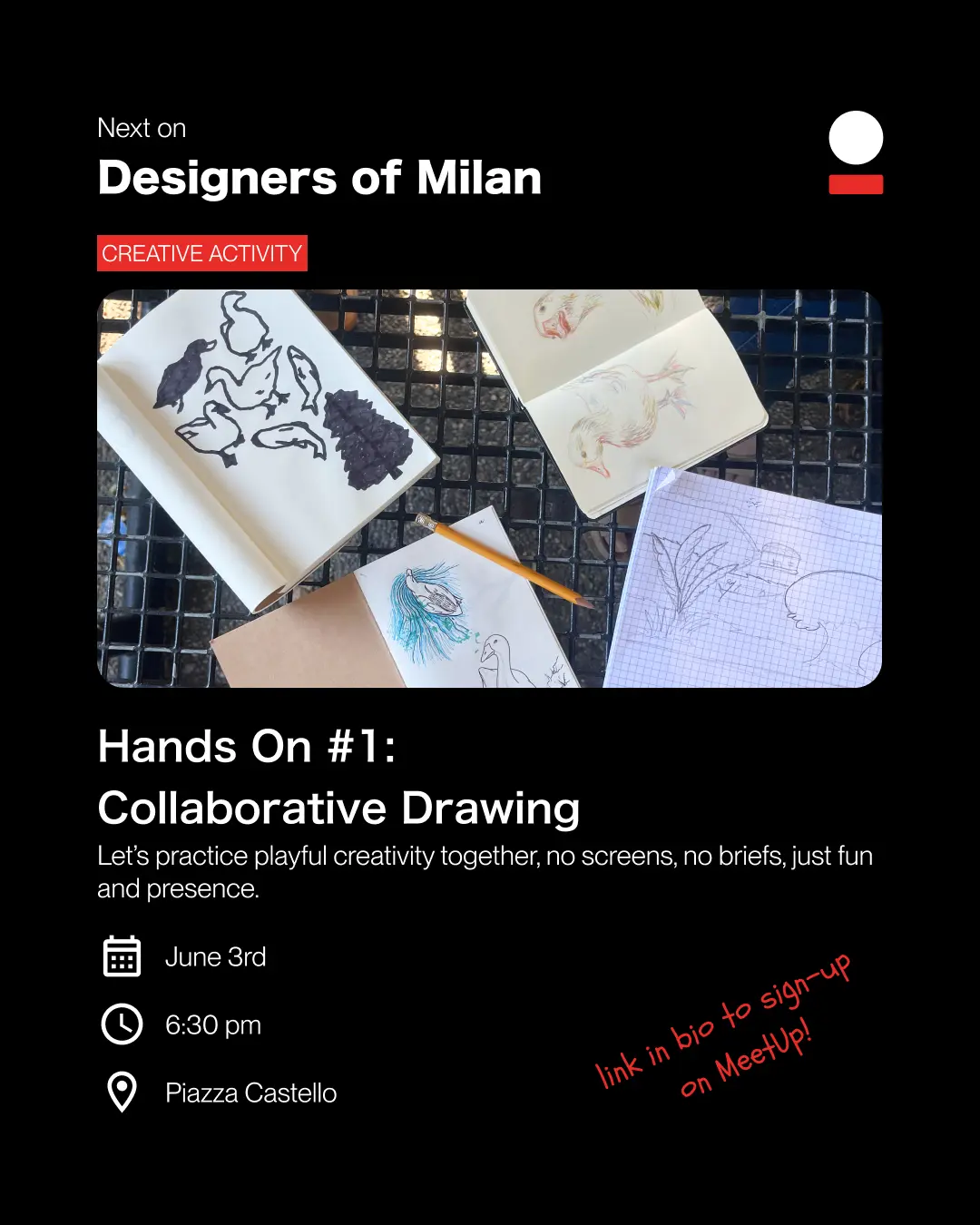
- Upcoming events — when and where to show up next.
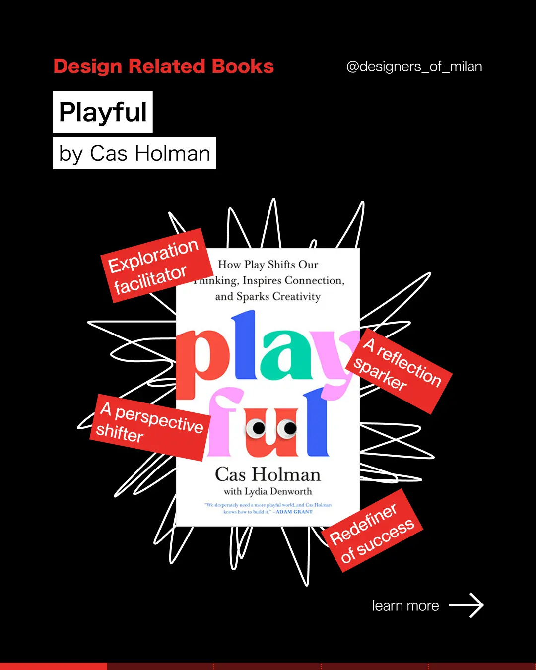
- Book recommendations — design books worth reading, one at a time.
Tone of voice
One sample post from each of the three formats:
Where it is now
Designers of Milan is ongoing. Events keep happening, the community keeps growing, the Instagram account keeps posting. What started as a hunch — that the city's design community wanted something less formal and more human — turned into something real.
5.0
Average MeetUp rating across 8 reviews
The recurring words across the reviews tell the whole story — exactly the feeling we set out to design for:
The biggest thing I've learned from building it is that communities are designed too. The format of the events, the tone of the posts, the choice to write in English, the colours, the typography — every one of those is a design decision, and every one of them shapes whether someone feels welcome enough to show up.